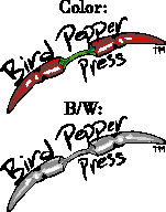
 Still pondering the self-publishing idea. Worked 11-1/2 hours today, so my brain is too cooked to do my manuscript any good. A few days ago I decided I didn't like the elaborate bird built out of hot peppers, so I reworked this logo for a colophon.
Gotta do more research when the book is closer to ready, as far as editing, legal issues, etc. I've ironically turned from an aspiring author dying to get his book in a 'Big Six' publishing house to thinking that I can't trust a publisher with my baby. If it doesn't potty train in a few weeks, they'll just drive it out in the country and dump it. And when I write a second novel, they can just point to the advance I didn't sell through. Then they can either tell me to fuck off, or grudgingly publish the second book. With a smaller advance, and on condition that I not get another dime of royalties until the combination sells through (even if they keep the first novel out of print). Max Barry only in the past few months reached this point with his first two books, which means he either got a ridiculously good advance on 'Syrup' or that even someone who's success I envy is marginal in an industry that thinks Dan Brown, John Grisham, Anne Rice, and that Harry Potter chick are all that and a jar of salsa.

2 comments:
I like the new logo. Even with my general cringing of phallic symbols.
The previous was nice too, but I though you were just riffin’ on the Paris Reviews logo.
My hot peppers are, like Freud's cigar, not necessarily phallic symbolism.
Yeah, the first one did look like the Paris Review bird a bit. Hadn't thought of that.
Of course, many rewrites to go before I have to worry about how to brand it. Maybe a pepper as a pen nib...
Post a Comment