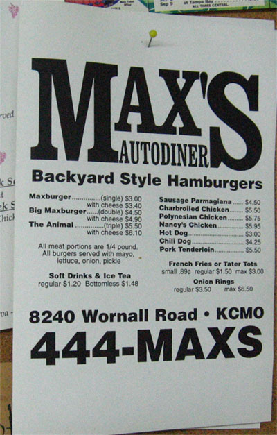
This menu is on the wall in the break room at my new job. I thought it looked a lot like the menus I used to do for John here and there. Then I realized, it was one of the take out menus I'd done for him. You can't really tell in the picture, but the paper is yellowing a bit at the edges. I think this was a freelance thing from 1999, when a house fire put me living closer to Waldo for a few days. If memory serves, it was mainly a tradeout for a few meals.

It's not really that big a typesetting gig, and as I said the other day, I never liked the logo. I had very limited software and equipment available to me at the time, and we did a lot of hasty paste-up work for the shoppers and political rags and singles tabloids taht were Nadler Publishing.
I recall what I really wanted to do was arch the Max's and scrunch Autodiner under it. Not that this would have been a logo to compete with such classics as Coca-Cola or the the Golden Arches, but it wouldn't have been so hard to believe when John fell in love with it, maybe...


No comments:
Post a Comment